South Africa is a rainbow for a reason. Our complexions carry warm desert gold, cool ocean dusk, and every undertone in between. Yet too many style guides still assume a narrow shade range. This guide from Alfridah Kgabo Matsi closes that gap with a simple, practical system anyone can use at home. No expensive gadgets, no guesswork. Just light, fabric, and a few minutes of honest observation.
Why a palette map matters
A personal palette is more than colour theory. It is a calm decision system that saves time and money. When you know which hues lift your skin, you shop faster, return less, and feel more like yourself on camera and in person. The goal is not to limit your choices. The goal is to choose with intention.
Step 1: Find your undertone the South African way
You do not need a lab. Use local light and objects you already have.
The daylight test
- Stand near a window between 10:00 and 14:00 under bright, neutral daylight.
- Hold a sheet of plain white paper beside your face.
- If your skin reads peach, golden, or olive next to the white, you lean warm.
- If your skin reads pink, rosy beige, or muted cocoa, you lean cool.
- If it shifts neither way, you are neutral.
The gold vs silver check
- Place a gold and a silver object near your collarbone.
- If gold looks smoother and silver looks harsh, you lean warm.
- If silver looks clean and gold looks dull, you lean cool.
- If both look fine, you are neutral.
The blush test for deeper tones
- Dab a small amount of berry lipstick high on one cheekbone.
- If it brightens without turning grey, you likely have cool or neutral lean.
- If it sits heavy or ashy, try an orange or brick tone. If that lifts you, you lean warm.
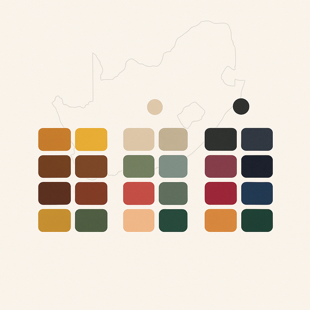
Step 2: Match undertone to a living palette
These swatch families are tuned to South African light and are easy to find in local stores. HEX codes are included if you create digital mood boards or shop online.
For warm undertones
- Spice and sun: Terracotta #CC6E3B, burnt saffron #E0A200, warm olive #7C8452
- Earthy neutrals: Camel #C19A6B, sand #D8C3A5, chocolate #4A2C2A
- Statement colours: Tomato red #D23C2A, marigold #FDBA21, teal leaning green #1D7F6B
For cool undertones
- Oceans and dusk: Deep plum #5A2A5B, midnight navy #0D1B2A, cool berry #9A2F6A
- Icy neutrals: Charcoal #33373A, blue-grey #6C7A89, pearl #F5F7FA
- Statement colours: Fuchsia #C61A72, cobalt #234C9F, emerald with blue base #0F6B5D
For neutral undertones
- Soft balance: Rose brown #A0685B, moss #768C5B, steel blue #4E6E81
- Flexible neutrals: Soft taupe #B6A69A, warm grey #8E8E8E, off white #F2F0EB
- Statement colours: Watermelon #F45B69, pine #2E6F57, saffron-peach blend #FFA94D
Tip: hold the fabric near your face. If your eyes look clearer and your skin smoother, keep it. If shadows deepen or the jawline looks tired, move on.
Step 3: Build a capsule that works year round
South African seasons swing between high UV summers and cool, grey winters. A palette that only works in one season will sit in the cupboard. Use this pattern.
The 5–4–3 formula
- Five core neutrals for trousers, blazers, coats, and handbags
- Four accent colours for shirts, knitwear, scarves, and skirts
- Three power shades for dresses, event outfits, or standout jackets
Example for warm undertone: camel, sand, chocolate, olive, cream as neutrals; saffron, teal-green, coral, paprika as accents; tomato red, marigold, deep turquoise as power shades.
Step 4: Beauty shades that respect undertone
Base and concealer
- Warm: golden caramel, olive beige, or red-neutral brown. Avoid pink-heavy bases.
- Cool: rose beige, neutral cocoa, or espresso with cool red. Avoid orange shift.
- Neutral: choose the closest true neutral. Adjust with a thin corrector only when needed.
Blush and lips
- Warm: peach, brick, terracotta, cinnamon.
- Cool: berry, rose, wine, cool cherry.
- Neutral: dusty rose, melon, muted coral.
Highlight and bronzer
- Warm: honey highlighter, bronze with olive base.
- Cool: champagne highlighter, cool-brown sculpt shade.
- Neutral: soft gold or soft pearl, mid-brown bronze.
Step 5: Photo and video proof — make colour work on camera
Daylight does not always match indoor scenes. A few small moves keep your palette consistent on screen.
- Use a lamp with 4000–5000K bulbs for a balanced white that does not turn yellow or blue.
- Place light at 45 degrees to the face to keep texture soft.
- Set phone exposure manually so whites stay white and deeper tones keep detail.
- Avoid white next to bright red on video unless you want very high contrast.
Step 6: Prints, patterns, and cultural dress
South African prints hold meaning. The goal is harmony, not erasure.
- Pair high energy prints with a neutral from your list to let the story lead.
- For warm undertones, reach for ochre, brick, and green-gold in Shweshwe or Ankara designs.
- For cool undertones, look for indigo, violet, and plum-based patterns.
- For neutral undertones, mix soft taupe or steel blue with your favourite cultural motifs.
Step 7: Sustainable choices that still look sharp
A palette map reduces waste through better planning.
- Buy natural fabrics when possible: cotton, linen, bamboo blends, wool.
- Choose quality over volume for coats, denim, and shoes in your strongest neutral.
- Use a repair kit: spare buttons, colour-matched thread, fabric glue for quick fixes.
- Keep a stain chart in your wardrobe area; treat fast so colours stay true.
Quick self-test: ten questions in two minutes
- Do I look fresher in gold or in silver
- Does white make me glow or wash me out
- Which three colours get compliments again and again
- Does my go-to lip lean peach or berry
- Which colour in photos makes my skin look grey
- Which jacket colour makes my teeth look whiter
- Which scarf do I reach for on tired days
- Do I feel calm in camel or in charcoal
- Which colour combination makes me stand taller
- If I had to choose one event dress shade today, what would it be
Your repeated answers reveal your lane.
Real life mini palettes
Corporate week, cool undertone
- Neutrals: charcoal, blue-grey, pearl
- Accents: cobalt shirt, cool berry knit
- Power: emerald suit for presentations
- Beauty: rose-berry lip, champagne highlight
Creative studio, warm undertone
- Neutrals: camel chinos, olive overshirt, cream sneaker
- Accents: marigold tee, teal-green scarf
- Power: tomato red work jacket
- Beauty: terracotta blush, honey highlight
Weekend market, neutral undertone
- Neutrals: soft taupe trousers, off white tee
- Accents: watermelon tote, moss cap
- Power: pine windbreaker
- Beauty: muted coral lip balm, soft gold highlight
Common mistakes and easy fixes
- Mistake: buying a trendy colour that fights your undertone
Fix: wear the trend away from the face as a skirt, shoe, or bag - Mistake: using a heavy foundation to force a match
Fix: keep the base light and correct only around the mouth and eyes - Mistake: wearing one high contrast outfit in harsh midday light
Fix: soften contrast with a scarf or cardigan in your best neutral
How Alfridah Kgabo Matsi maps palettes for clients
The process is short, honest, and collaborative.
- Light and mirror — neutral daylight check with fabric drapes
- Undertone confirmation — paper, metal, and blush tests
- Wardrobe audit — remove heavy clashes, keep clear wins
- Capsule build — 5–4–3 formula with budget and lifestyle in mind
- Photo setup — lighting plan for phone and studio
- Follow-up — seasonal refresh and event planning
Clients report fewer returns, faster dressing, and more relaxed shoots. Most importantly, they feel seen.
Your next step
- Pick your undertone using the tests above.
- Choose five neutrals today and write them on a note in your wallet.
- Add four accents during the next two months, not one weekend.
- Save three power shades for events and important meetings.
- Take one selfie in daylight after each change to confirm lift.
If you want a custom session, colour deck, or a team workshop, book time with Alfridah Kgabo Matsi. The aim is simple — a wardrobe and beauty kit that works with your skin, not against it.
Optional resources you can request
- Printable wallet swatch sheet with the HEX codes above
- Studio lighting cheat card for phone content
- Event colour planning template for weddings, graduations, and brand campaigns